
Having become a fan of Muji from my travels abroad, I always looked forward to visiting their stores and perusing their fascinating line of understated and functional product. So, it was with great anticipation that I awaited the opening of the Toronto store last week – however, I was left unimpressed and disappointed.
Muji: The brand
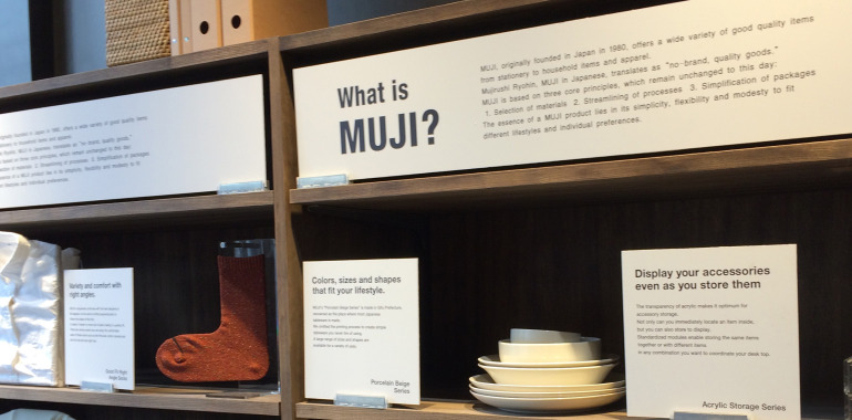
Muji is all about simplicity. They are the ultimate anti-brand, forgoing splashy labels, packaging and advertising – yet by doing so they have become one of the most successful brands in the world. Muji which means “no brand quality goods” has built an international reputation and loyal following by providing customers with a wide range of products from apparel to household furnishings to travel accessories – all with a minimalist aesthetic driven by functionality. Complementary to the product, the store design has always been an extension of the brand, with honest materials, simple shelving and merchandising.
Well-established in Europe and Asia, Muji arrived in North America in 2007, opening a store designed by famed Italian architect Renzo Piano in Times Square, New York. Other high-profile stores followed in Soho, Chelsea, Noho and in California (Hollywood, San Francisco, Santa Monica and San Jose). When the announcement came earlier this year that the first Canadian store would open in Toronto in November, with seven other locations in the next five years, I had great expectations.
The TO store
When the location in the Atrium was revealed, I was skeptical. With a retail mix of independent retailers serving the office tower above, the Atrium’s only selling feature is its Yonge and Dundas location adjacent to the Eaton Centre. For a no-brand retailer the quality of neighbouring brands might seem like less of a concern, on the basis of principle, however this location is off-brand even for Muji.
The space too is less than desirable. Far from the clean architectural spaces that speak to the philosophy of the brand, this space is awkward and convoluted with a level change, odd shape and two entrances. Ill-conceived merchandising, splitting the tiny women’s and men’s wear sections between the entry areas doesn’t help the issue. Here, creating a critical mass of apparel would have gone a long way to visually expand the space and bring a greater sense of order.
 Sure, it’s a nice space, with Muji’s quintessentially utilitarian shelving, simple displays and effective in-store communications; but the weak choice of both location and space is a novice retailer mistake – a successful retailer like Muji should know better.
For a successful international retailer like Muji, this disappointing location is likely inconsequential. With such a rabid fan base, this misstep will probably have little or no effect on their expansion plans. However, as a proud Torontonian, retail designer and avid shopper I feel short-changed. While other cities have received flagship quality stores we’ve received a so-so store experience!